Mise en Place
Stat arb prep matters as much as the recipe
Part 6 of 6: Statistical Arbitrage for Independent Traders
Previously:
A Tale of Two Prices (the core idea of stat arb)
Moneyball (finding good pairs using metrics that matter)
The Winter of our Pairs Trading Discontent (problems, limitations, frustrations)
The Metamorphosis (from pairs to portfolio)
Treasure Island (the mispriced leg doesn’t always revert)
Most retail stat arb is pairs trading. Triangulated Stat Arb is what you get when you let many pairs vote on each ticker.
The five articles before this one walked through how I got here. At its simplest, stat arb is a bet on convergence: two related stocks drift apart, and you bet on them coming back together.
Pairs trading is the canonical version of that bet, but it’s wasteful for a solo operator. Triangulated Stat Arb builds a clean universe of good pairs, flattens each one into per-ticker views, and aggregates across pairs to find tickers that are mispriced. You trade a portfolio of tickers rather than pairs.
In Treasure Island, I described the three pieces of that approach: good pairs as the foundation, triangulation and consistency to extract the juice from those pairs while discarding the pulp, and volume, news, and event features to avoid the traps (pairs that don’t converge).
In this article, I want to show you what it looks like when you properly resource all three pieces.
A note before we start. I’m going to walk through the three pieces conceptually rather than hand you the implementation. There are two reasons. First, the broad methodology is the part that generalises regardless of your constraints. So you should come out of this with a clear picture of what each piece does, where the leverage is, and what makes the whole thing work. The exact filters, scoring weights, and cutoffs are operational/implementation choices that depend on your objectives and constraints. Also, the broad methodology is what I’m happy to talk about here. The implementation details don’t belong in public.
Two more things worth mentioning up front. First, I want you to notice a clear hierarchy of what adds the most bang for your buck. I’m going to highlight which pieces do most of the work and which add incremental value at the margin. Not all three pieces pull equal weight! You can get quite far with only one or two of the most important pieces, and for a solo trading operation, it’s not obvious that the marginal performance improvements justify the added operational overhead. That’s very much a personal thing and depends on your constraints. Second, Euan and I have been trading this live for a couple of months now. The production version is what I’m talking about throughout.
OK. Three pieces, in order of importance.
Good Pairs (the foundation)
Pair selection is the load-bearer. If the universe of pairs is rubbish, nothing downstream saves you. If it’s good, the rest of the work adds value.
In our framework, two metrics define a pair’s quality. The first measures frictionless returns to the spread trading mean-reversion over the lookback window. Does buying the cheap asset and selling the rich one make money in a frictionless setting? Some spreads diverge and stay diverged. Their reversion-factor score is low or negative, and we want to steer clear of those.
The second measures how consistently the spread tends to converge after it’s diverged. Did the spread drift apart for the entire formation period, and then randomly come together at the end of the period? Or did it reliably converge after diverging?
Put them together and you get a decent filter for the things we care about - a pair of stocks that tends to reliably drift apart and come back together enough that you can trade it profitably.
Notice how we measured the thing we care about directly. Not a cointegration test as far as the eye can see!
There’s more information about this approach in Moneyball - Finding Undervalued Pairs Using Unconventional Metrics.
We typically export the top 10% of pairs from this ranking system, provided those pairs make economic sense (broadly exposed to similar risk factors). We do this every month, based on the prior 24 months of history.
Within this top 10%, we split into 5 tiers. Here are the before-cost returns to trading a simple pairs strategy on each tier, equal-weighted (you couldn’t trade this; it’s just to illustrate the effectiveness of the ranking system):
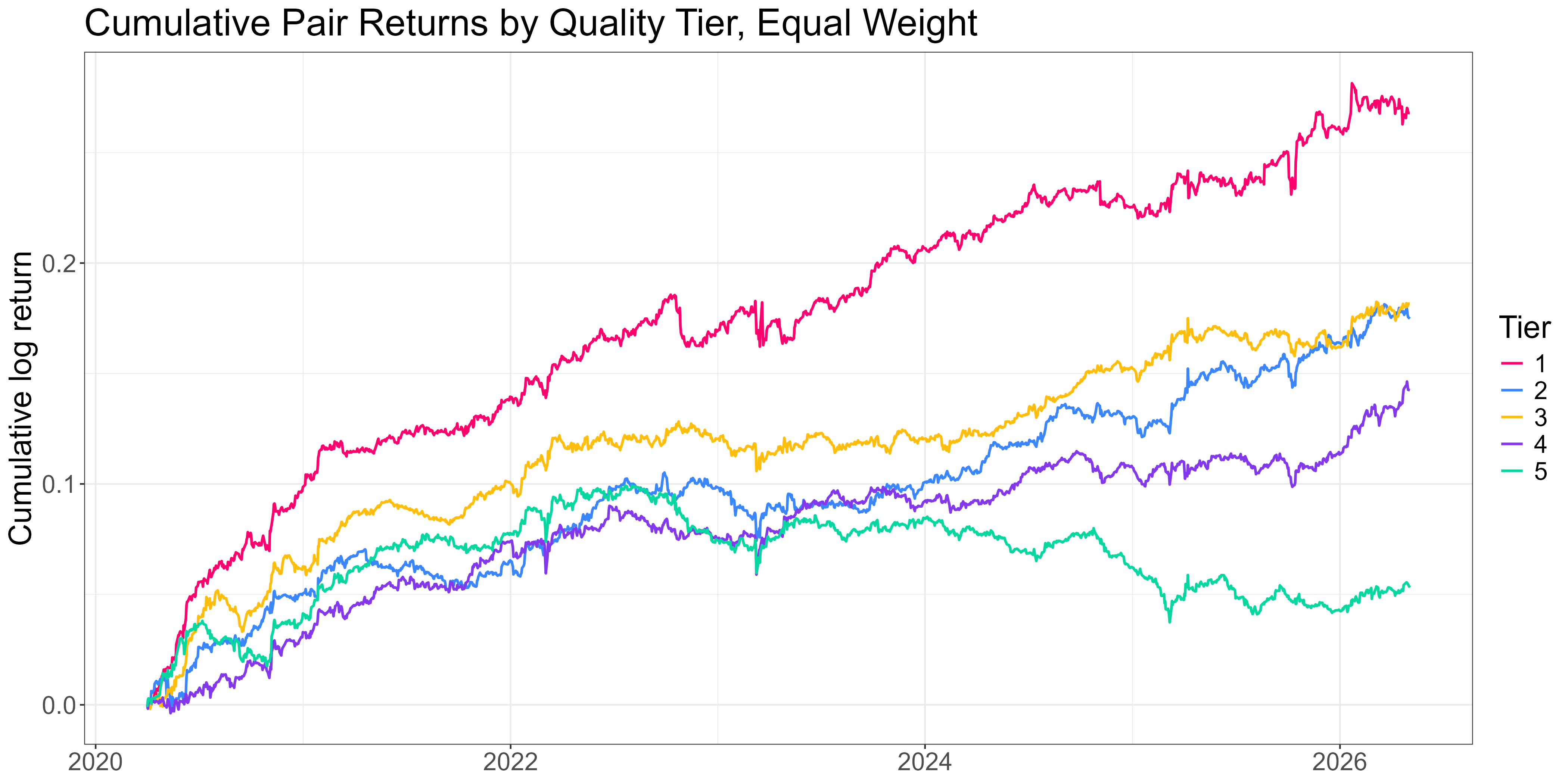
The ranking system does a good job. Tier 1 sits comfortably at the top; the middle tiers are messier; Tier 5 is meaningfully worse than the rest.
Quantifying risk-adjusted returns to each tier:
Tier 1 (best): Sharpe 1.6
Tier 2: 1.3
Tier 3: 1.4
Tier 4: 1.1
Tier 5 (worst): 0.42
About a 4x Sharpe spread between top and bottom, with the middle tiers noisy but reasonably high performing (at least in terms of Sharpe… total returns are low… one of the drawbacks to trading pairs… more on the solution to this below).
That isn’t a small effect. It dwarfs anything you can squeeze out of the signal-side work that comes later in the pipeline. Good pairs are the basis for everything.
There’s plenty of subtlety in how the pipeline generates and refreshes the pair universe. Liquidity filters, industry constraints, refresh cadence, handling delistings and acquisitions. All things you need to take some care with.
But the point worth taking away is this: the work that pays off here is the slow, careful upstream work of producing a clean, ranked pair universe.
Yes, it’s more painstaking and requires a lot more thought than asking Claude to blast through a million or so cointegration tests... but it actually works. And critically, most of the alpha you’ll capture across the rest of the pipeline is already determined by the time the universe is set.
Triangulation and Consistency
Once you’ve got a universe of good pairs, you stop thinking in pairs and start thinking in tickers. This solves the main drawbacks of pairs trading that hamstring the solo trader (capital inefficiency and signal wastage). See The Winter of our Pairs Trading Discontent for details.
For each ticker that appears in the universe, look at every pair it sits in. Each pair gives you a per-ticker view (long the cheap side, short the expensive side) and a z-score that says how far the spread is from its rolling mean. Aggregate those per-ticker views across all the pairs the ticker appears in, and the aggregated view is what you trade. More information about this approach in The Metamorphosis.
Done well, the network signal is a meaningful improvement over trading pairs. If multiple pairs all agree that a ticker is mispriced, you’ve got stronger evidence than any one pair could give you on its own.
Done naively, it’s not much better. Two ways to break it:
Naive averaging. If you take the mean of every pair’s z-score for a given ticker, the bad pairs cancel the good pairs, and you end up with a noisy aggregate. Production aggregation is quality-weighted: better pairs contribute more, worse pairs contribute less.
Ignoring depth and consistency. Tickers that appear in many pairs aren’t automatically more reliable. A ticker in three high-quality pairs may give you a stronger signal than a ticker in twenty mediocre ones. Production aggregation accounts for both depth (how many pairs is the ticker in?) and consistency (do the pairs agree on direction?), as well as source pair quality.
The other operational decision is what to do once you’ve got a ticker-level signal.
The signal is most informative in the tails. The middle of the distribution tends to be noise. Trading the extremes, rather than every name in the universe, materially improves the result. This is analogous to the pairs trade - you wouldn’t enter a pairs trade at a zscore of 0.5.
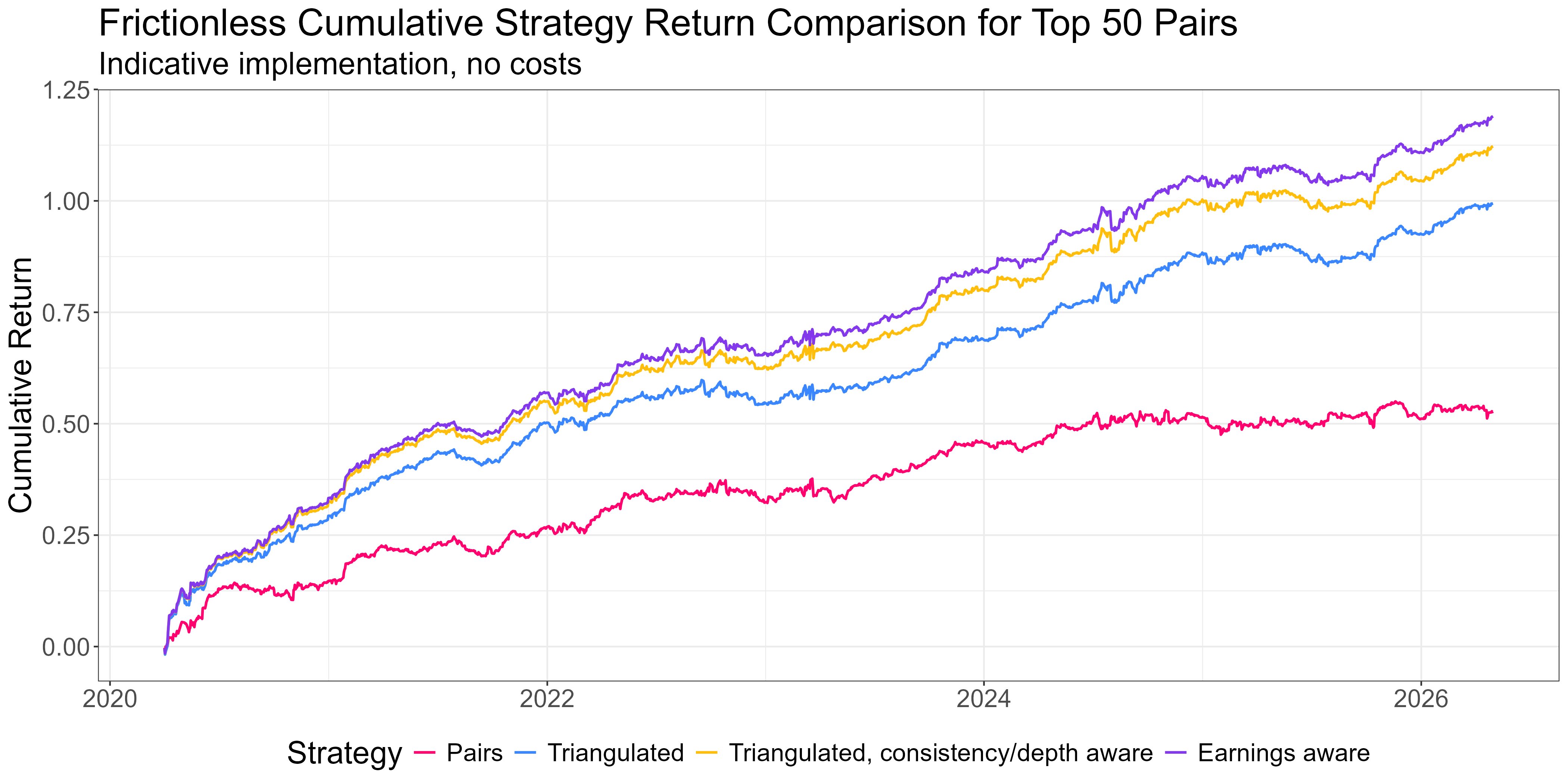
Here’s a plot of cost-free returns to trading a portfolio of the top 50 pairs vs trading them as a triangulated long-short portfolio of mispriced legs vs including depth and consistency:
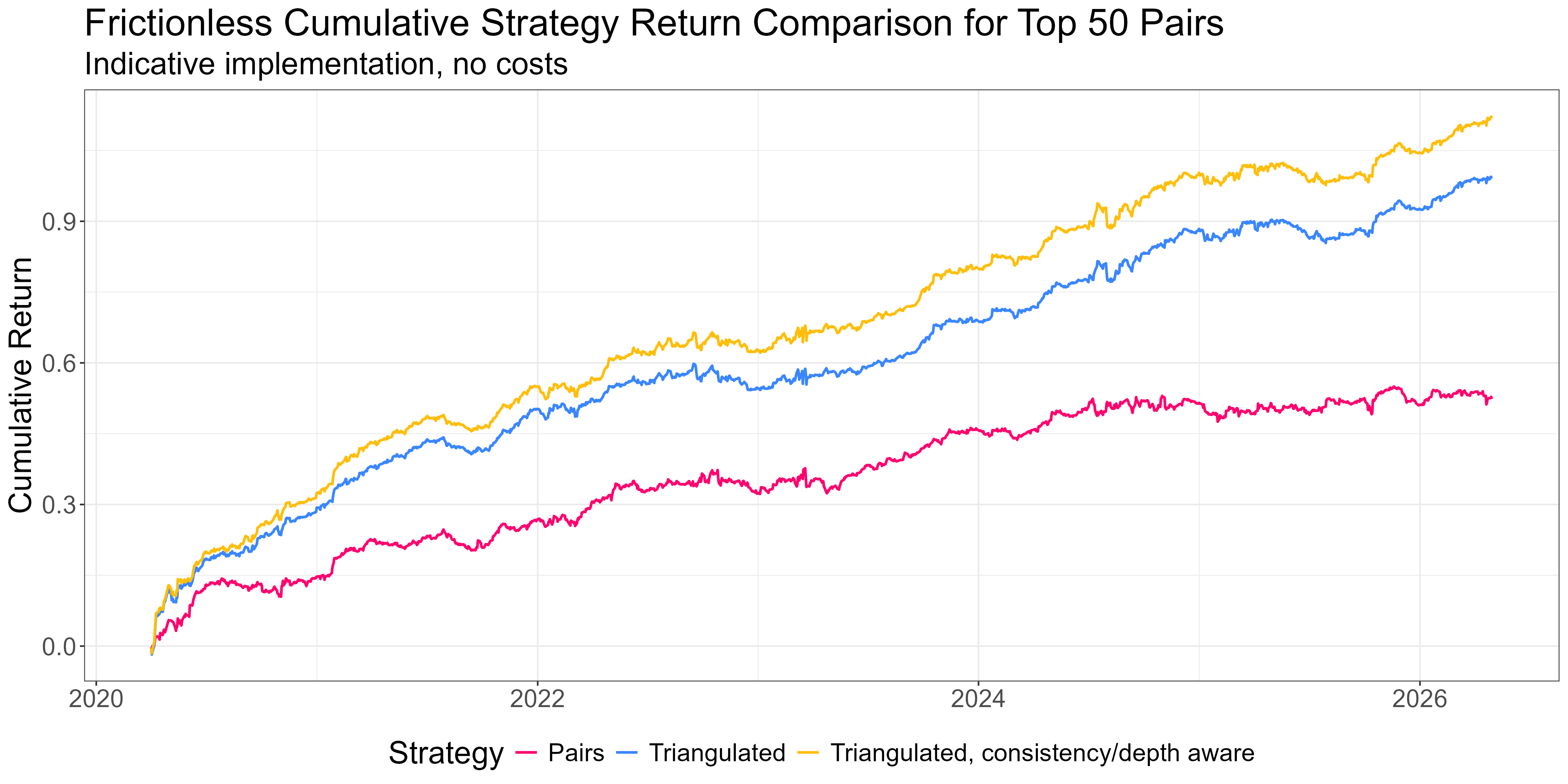
A portfolio of mispriced legs vastly outperforms trading pairs. Considering consistency and depth squeezes out a bit more. And it’s much more capital efficient for the solo operator.
Don’t Get Run Over
Our Triangulated Stat Arb signal tells us that
A spread diverged
Which ticker caused the divergence
But it can’t tell you why a spread diverged. A spread that says “short the expensive leg” looks the same whether the expensive leg ran up because of forced flow that’ll reverse or because of new information that just repriced the stock. The first situation is a good fade. The second not so much.
Distinguishing those situations is the third piece of the puzzle.
The natural places to look are volume, news, and event data. Each of these can in principle provide clues to whether a divergence is technical (fadable) or fundamental (don’t fade).
The research landed in some places I didn’t expect.
The volume work is parked. We chased a volume-asymmetry signal, based on the intuition that forced selling on the cheap leg looks different from informed buying on the expensive leg. The effect was real at the pair level. But when we plugged it into the production strategy, the effect was tiny. Most of what volume was telling us was already captured by the upstream pair-quality work. There’s a deeper write-up on why aggregation from pairs to tickers broke the signal, but the punchline is that volume features aren’t currently in the live strategy. If I were just trading pairs, I’d definitely include our volume feature. But it doesn’t add much to our Triangulated Stat Arb portfolio that we aren’t already getting elsewhere.
The win has come from a different angle: an earnings filter. When there’s an earnings surprise in a spread’s formation period, the spread will look stretched in the direction of the surprise. But the stock that’s moved in such a scenario has repriced on something real, and is therefore not something you want to fade. The mechanism makes a lot of sense, and it’s supported by the data. It gives another small but meaningful bump in the live strategy.
This is a plot of three-day reversion (3-day forward returns signed by the negative of the zscore) when there’s an earnings surprise in the zscore’s formation period. When the zscore is stretched in the direction implied by the surprise (red bars) we see significantly less reversion. For large surprises, the reversion is actually negative on average (that is, we see continuation - a manifestation of the post-earnings drift effect).
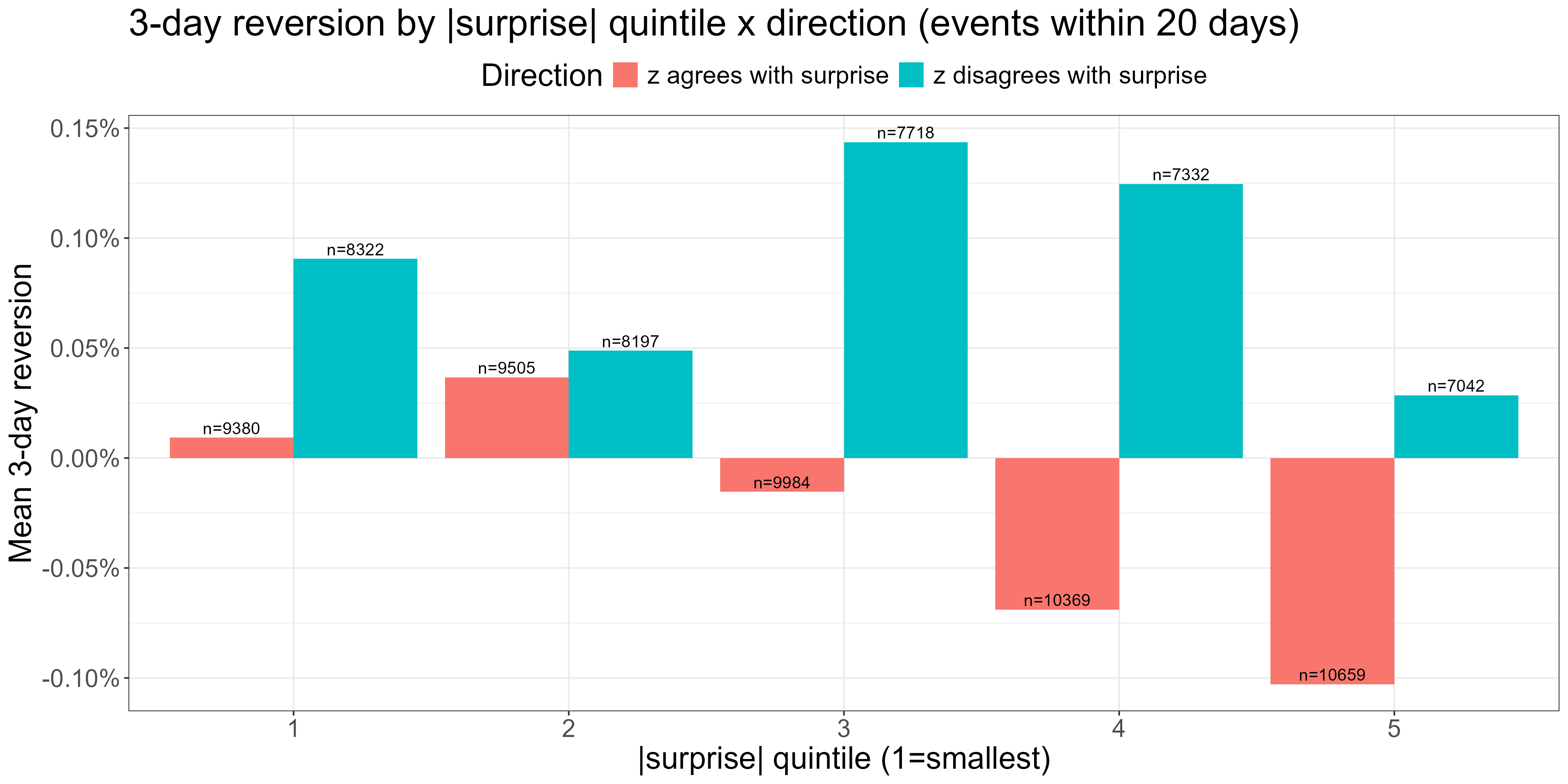
Adding an earnings filter:
News features more broadly are the next frontier. The intuition that worked for earnings should generalise. Any surprise event that moves one leg of a spread on genuinely new information probably does damage to the mean-reversion thesis. That’s next.
While the third piece clearly matters, we see smaller improvements than you would expect. That’s because the pair-quality work upstream is doing a lot. It’s 80-90% of the game, and that becomes clearer every time something that “should” work provides incrementally smaller gains.
That’s the methodology. Here’s what it looks like resourced.
In RW Pro, we have an API serving end-of-day and hourly intraday spreads data to support live trading, as well as historical feeds to support the research effort.
The upstream pipeline that produces all of this is itself worth mentioning. Generating a monthly pair universe from a few thousand candidate stocks requires substantial data ingestion, cleaning, and ranking computation across hundreds of thousands of candidate pairs. The data and compute alone would cost more than a year’s RW Pro subscription, before you count the time to build and maintain the infrastructure. We’ve done that work once and run it for the group.
The data is for exploration as much as for trading. The community works in a research environment that holds the full historical datasets the methodology was built on, and they can poke at any of it however they like. If you want to test your own hypothesis about what makes a pair “good,” or what extra feature might tighten the third piece, or how you might construct your signals differently, the data is there.
The research environment also holds an example-implementations notebook, and surprisingly this is the part of the offering I’m proudest of.
There’s no canonical signal that everyone trades. Different account sizes, different cost structures, different risk tolerances, different operational capacities all need different configurations. Members can try the configuration knobs (universe size, weighting scheme, no-trade buffer, signal threshold, leverage, and others) and see what fits their own situation.
This is more important than it sounds. The underlying framework and research are consistent, but the implementation gets configured to fit each member’s situation. This forces a deeper understanding that builds better traders in the long run.
There’s no “one size fits all” solution; only trade-offs to be understood and navigated. The exited-startup-founder trading a $5M portfolio full-time has different constraints from the working father-of-two who’s trading $100k on a less-than-part-time basis. We have a community of traders not only running solo operations of all sizes and flavours, but understanding exactly what they’re trading, why they’re trading it, and what the trade-offs are. In short, we’re developing people’s independence. Regardless of what happens in the future, they’ll always have the ability to catch a fish, because they understand not only how to be successful anglers, but how to captain their own boat.
The work that produced this didn’t happen in a vacuum either. The research unfolded over six months in the membership, with the community watching every step, asking questions that pushed the work forward, and contributing their own research when they spotted something we’d missed. Some of those contributions are in the live strategy now. The work flows both ways and everyone benefits.
So that’s what it looks like when the three pieces are properly resourced.
The hierarchy is one of diminishing returns. Pair selection at the universe level gets you most of the way. Aggregation across pairs adds a meaningful uplift on top. Depth- and consistency-aware filtering refines that with a smaller uplift, and the earnings filter adds something smaller still. Volume sits parked, and news is the next frontier. The pattern is consistent: each successive piece pays a smaller marginal return on the time you spend improving it. Pair selection is where the whole thing either lives or dies.
The Triangulated Stat Arb approach is what makes equity pairs worth trading as a solo operator. The infrastructure (the data API, the research environment, the example-implementations notebook, the community pulling on the same questions) is what makes it realistic without becoming a full-time engineering job.
If you’ve followed the series this far, you’ve now got the conceptual map. If you want to see what the resourced version looks like in motion, the door is open.